
Dulux Colour Forecast 2026
Why I am Loving ‘Evoke’
Every year, the Dulux Colour Forecast sets the tone for the year ahead in design. Since 1999, Dulux has been predicting the colours that shape how Australians decorate, style and connect with their spaces. What began as an industry report has grown into a cultural barometer, reflecting how global events, lifestyle shifts and consumer sentiment translate into colour. Today it’s the benchmark for designers and homeowners alike…a trusted handbook that influences interiors, fashion and even the way we talk about our homes.
This year’s forecast moves away from the bold contrast schemes of previous years and turns toward warmth, calm and reconnection: with ourselves, each other and the natural world. The result is three palettes that feel grounded, restorative and deeply liveable: Ethereal, Elemental and Evoke.
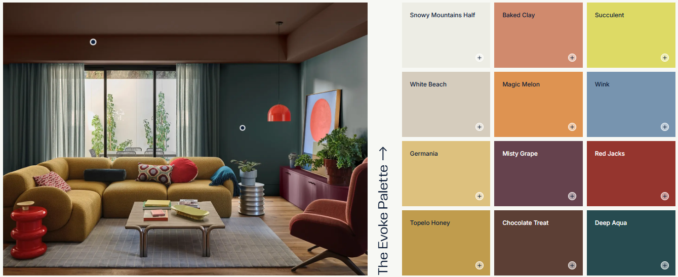
Dulux Colour Forecast 2026 - Evoke
Ethereal blends soft and mid-tones of greens, mauves and blush pinks. With vintage rose, buttercream and gentle pastels, it has a lightness that feels joyful yet restorative.
Elemental takes its cues from raw, enduring materials like stone, concrete and timber. It’s a palette anchored in durability and lasting utility, reflecting a design ethos that values repairability and responsibility.
And then there’s Evoke, my favourite, which leans into rich, comforting tones instead of brights. It’s all about deep, warm neutrals, earthy greens, soft clays and mellow pinks.
For me, Evoke speaks of nostalgia and memory. These colours feel timeless and familiar, connecting us back to nature and place. They mirror the Victorian High Country, where I live and design: the olive greens of mountain gums, the terracotta soil underfoot and skies that shift through endless autumnal tones from golden light to pink and blue horizons. Seeing these shades captured in the forecast is like seeing our local landscape reflected in a national design conversation.
I touched on this in a recent reel, and you’ll already find echoes of Evoke in our Phoenix Collection at Curated for KIN. Long before Dulux unveiled this year’s palettes, at Britt White Studio, we were embracing these nostalgic hues to create spaces that feel warm, connected and enduring. It shows that true colour inspiration doesn’t follow trends…it emerges from the places and stories that matter most.

Phoenix Collection Living Room

Phoenix Collection Dining Room
For me, the Colour Forecast is always both inspiration and affirmation. It validates what we instinctively know about colour’s power, while also encouraging us to experiment and bring fresh energy into our homes.
If you’re considering a refresh and aren’t sure where to begin, colour is possibly the most transformative place to start. A well-chosen palette can completely shift the mood of your home, creating spaces that feel calmer, brighter or more grounded.
If you’d like guidance on bringing the 2026 palettes, or your own colour inspiration, into your home or investment property, take the Curated for KIN Style Quiz. Alternatively, we offer Colour Consultation as a standalone service at Britt White Studio.
Together, we’ll create a scheme that feels personal, timeless and perfectly you.